Duration
4 weeks
Focus
User Research
Market Analysis
User Interviews
User Testing
Deliverables
Prototype
UX Flow
UI Kit
Desktop Design
Responsive Design
Industry
Pet rescue
Introduction
Pet Rescue is focused on creating a commercial enterprise, by a searchable website that helps pets find a home and people find a pet. Pet Rescue serves and covers dogs and cats in North America, focused on abused animals, abandoned by their families, or suffering from natural disasters. The final objective of Pet Rescue is to find a temporary home/fostering in order to avoid euthanasia by animal control.
Problems
-
Each year, approximately 2.7 million dogs and cats are killed.
-
Current pet adoption websites do not update available dogs and users complain about having applied for an animal that was already adopted.
-
Applicants do not get responses about their applications.
-
People say that adoption requirements are highly restricted and do not facilitate the process.
Goal
-
Design a responsive website (desktop and mobile) that covers core functionality: search for pets, information about specific pets and shelters, and the importance of adoption.
-
Define a new branding for Pet Rescue.
-
Offer multiple categories in the filter to improve the chances to find the desirable pet.
-
Send notifications when a pet is available or was already adopted.
-
Promote offline campaigns to encourage people to adopt pets with responsibility.

How can we solve issues that users have with existing adoption websites and bring them to Pet Rescue?
Design Process

Step 1: Research
Competitive Analysis:

Research Questions:
Do people prefer buying or adopting pets?
What make them adopt a pet?
What channels do they use to find pets for adoption?
Do people find it easy searching for pets that meet their needs?
Did they ever get denied in past adoption/foster requests?
Did they get responses after adoptions/foster applications?
How was their experience navigating these websites?
User Interviews:
Through a fluid call interview with four participants, I tried to capture their emotional, social, and irrational motivations that affect the way these users behave, focusing on their current problems or pain points, and ultimate goals. These were a few main points that interviewees expressed during the sessions:


Insights
Goals and Needs:
-
Clear and effective communications with shelters and fosters
-
Getting responses after applications
-
Less bureaucracy in the adoption process
-
Image gallery of pets available
-
Detailed information about pets, such as behavior, their history, vaccination, issues, diseases, location, etc.
-
Filters that help to find desirable pets
-
Contact page, pet care and tips
-
Updates about the process sent to email/SMS
Pains and Frustrations:
-
In general, none of the participants were successful with adoption websites
-
Long forms, including images to prove the size of the house (yard size, rooms, fenced yard…)
-
Bureaucracy in the adoption process
-
Lacking information in pets profiles
-
Allowing users to do the application for a pet already adopted
-
Working with independent shelters that causes bad communication
Step 2: Define
Users Personas:
Based on insights from user interviews, I was able to define a persona that represents a user's behavior, needs, frustration, personality, and goals. Gisele is also a Pet Rescue target.

Sitemap
A sitemap was created to provide information about the pages, categories, and other files on the website.
.png)
Task Flow
In Task Flow, we show the high-level steps that a user would take to apply for adopting a dog.

User Flow
In User Flow we have a path that the user took to conclude a task, adopting a dog on Pet Rescue's website.
.png)
Step 3: Ideate and Prototype
UI Kit:
I looked for inspiration in visual concepts that I thought would be ideal for the brand.
A fun logo, color palette, components, and typography that would match perfectly with the proposal.
This is the result:


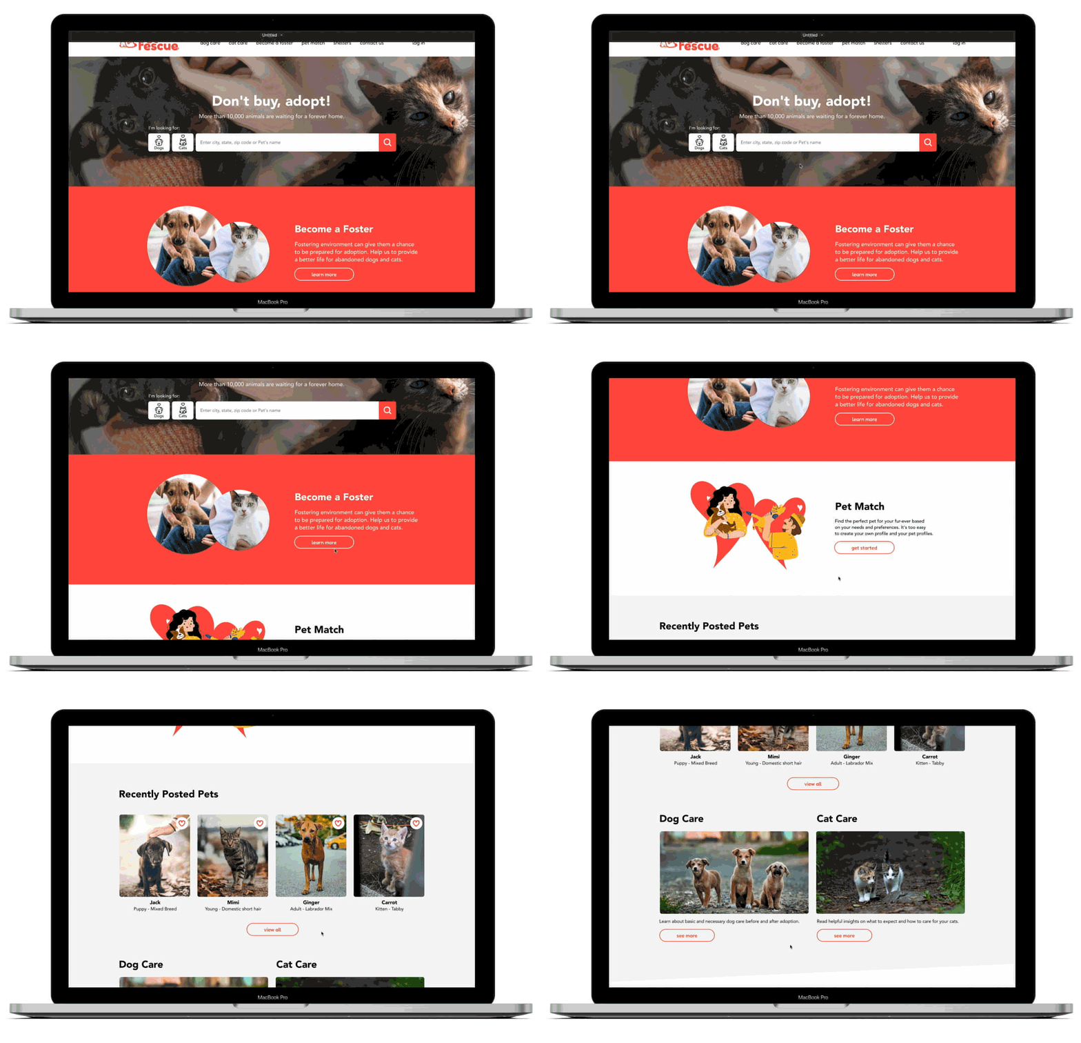
High-Fidelity Wireframes:
Desktop


Responsive:


Step 4: User Testing and Iterations
Objective:
I promoted remote testing with screen sharing with three participants in order to better understand how users complete tasks and find out what were their difficulties.

Affinity Map:
After a few hours of testing the website, I gathered qualitative information about users and grouped it by category to understand their experience.
.png)
An icon was added to the save search bar.


Additional information such as vaccination and neutered status were added to the pet's profile.

The image gallery was resized to fit on the screen and reduce scrolling.

Specify adoption and foster requirements.
Iterations:
Based on users' feedback, I gathered their information on what could be improved in the existing layout for all devices.
Conclusions
-
Often, people who cannot adopt a pet end up choosing to buy an animal in stores or directly from a breeder. Buying a pet encourages the massive sale of animals, through puppy mills.
-
Improving communication between shelters and people and facilitating the adoption process was one of the important goals in the development of this project.
-
Listening to the interviewees' pain points was essential to understanding how to solve problems on current rescue websites and bring solutions to Pet Rescue.
-
Designing a website individually can be easy but user testing shows us that each person has a different understanding and doing iterations are more than necessary in order to offer a useful product for everyone.


